In the Results section, we explore data visualization with the Alluvium plot, Mosaic plot (general, faceted), Stack-bar plot (count and proportion), and Cleveland-dot plot. We then analyze the data from various aspects, as different information has been provided by each plot.
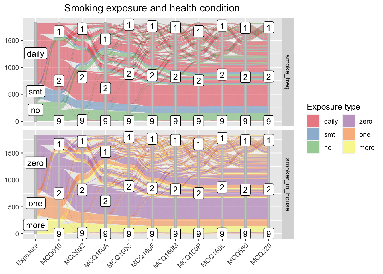
3.1 Alluvium plot
We visualize two Alluvium plot2, where the flows are the two independent features - smoking frequency and number of household smoker - relatively. While the two panels has different stratas that represent each independent feature on the first axis, they share the remaining sets of axes, each representing a disease potentially associated with smoking exposure. These shared axes each describes a health condition, where “1” stands for “has the specified disease”, “2” stands for “no”, and “9” stands for “unknown.”
From the visual, we can see the majority respondent smokes daily, and the majority household has zero smoker. These two findings do not contradict since the household smoker number does not include the respondent.
The flow patterns for the two independent features are visually similar yet provide different information. From the upper panel, we observe that the majority respondent - the daily smokers, casual smokers, and non-smokers - do not have any disease, and only a few people answers ‘unknown’ toward their health condition. Most people having one disease does not have a second disease. Most people having disease are daily smokers, or, surprisingly, non-smokers.
From the lower panel, we observe that the majority household has no smoker (exclude respondent). A larger proportion of respondents in households with one or more smokers have disease, comparing to that of respondents in households with no smoker.
We can also see whether people having one disease have other diseases by tracing the flows. However, we will not discuss the findings here since the study focuses on the health concern associates with smoking.
While the alluvium allows us to trace the flows, the plot becomes complicated since we have too many features. We will explore other visuals to have a more thorough view of the case.
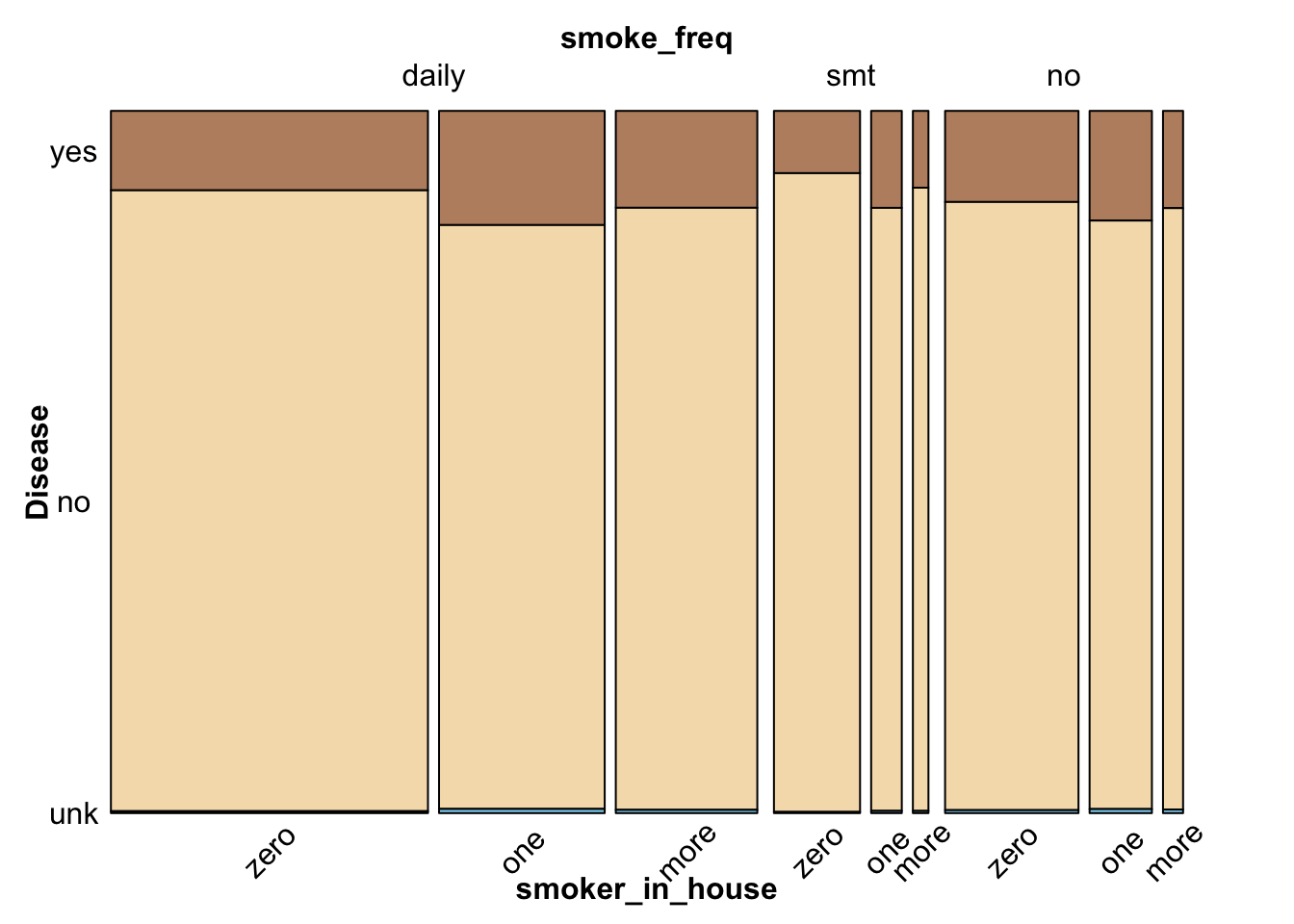
In the mosaic plot, we study the relationship among the two independent features and the dependent feature: health condition, represented by medical history associated with ten diseases. We plot all diseases as one feature on the first, general plot and study each separately with facet on the second plot.
3.2.1 General Mosaic plot
The general mosaic plot supports previous observations and provides additional information on the proportion of data in groups. Since the ten dependent disease features share the same set of labels, we combine them into a general health-condition feature, where “yes” stands for “having disease”, “no” for “not having disease”, and “unk” for “not knowing if having disease.” The modified data reflects the true proportion of health condition since the total number of observations for each disease feature is the same.
From the general mosaic, we conclude that the majority respondent have no disease. Among respondents who have diseases, most people are daily smokers, or have one smoker (not including the respondent) at home.
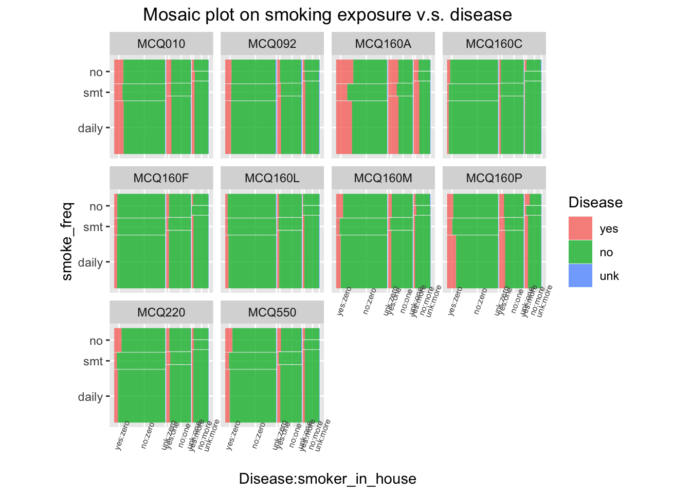
3.2.2 Mosaic plot for each disease
A faceted mosaic plot is drawn to study the data proportions for each disease and to check whether Simpson’s paradox exists. From the plots, we observe that daily smokers and non-smokers have the highest proportion of having diseases. On MCQ160P, daily smokers take a greater proportion of people having disease; on MCQ220 and MCQ550, non-smokers are the majority. Also, a larger proportion of respondents in households with one or more smokers have disease, in comparison with the proportion of respondents in households with no smoker. The previous observations are generally supported, so the Simpson’s paradox does not exist.
The faceted plot provide additional insights on each disease. For example a small proportion of respondents have MCQ160C, and little variation is observed from group to group. Therefore, MCQ160C may not have a significant association with smoking exposure.
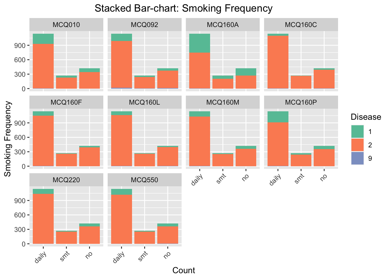
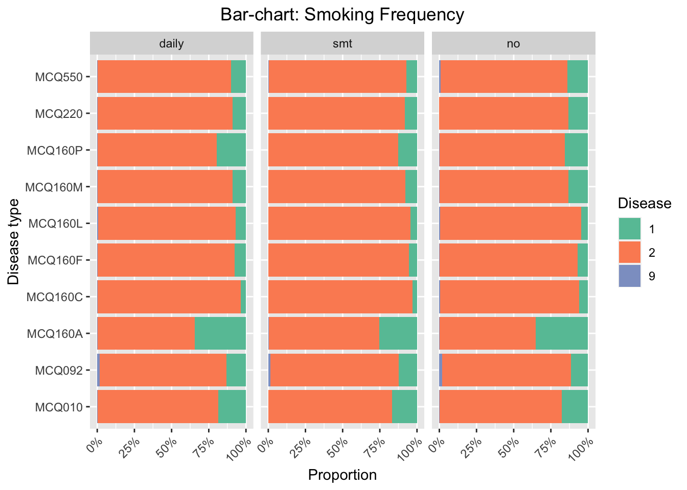
3.3 Bar-chart facet by types of diseases
In this part, we analyze the possible influence of smoking exposure to having certain disease. The smoking exposure is divided to smoking frequency and secondhand smoking exposure.
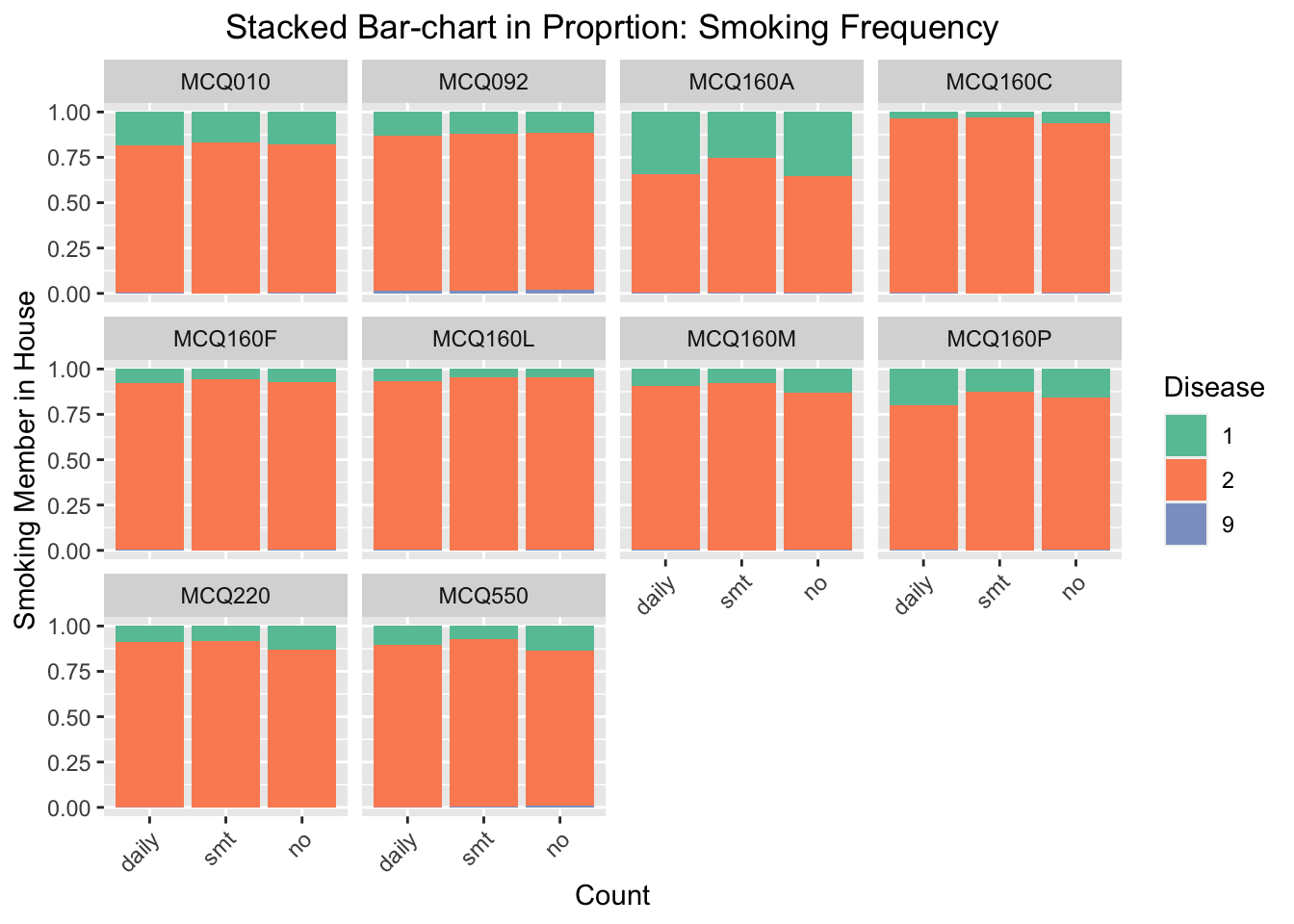
We focus on the influence of smoking frequency to the probability of having certain disease. We find that the influence of smoking is especially noticeable for MCQ010-asthma, MCQ160A-arthritis, and MCQ160P-COPD, emphysema, ChB. For these three categories, the number of respondents smoke daily and have had the disease is much higher than the number of respondents do not smoke daily and have had the disease.
Code
#bar chartggplot(data_direct, aes(fill=Disease, x=Smoking_exposure)) +geom_bar(position='fill') +facet_wrap(~Disease_type) +scale_fill_brewer(type ="qual", palette ="Set2") +theme(plot.title=element_text(hjust =0.5),axis.text.x =element_text(angle =45, hjust =1))+labs(x ='Count', y ='Smoking Member in House', title ='Stacked Bar-chart in Proprtion: Smoking Frequency')
We regenerate the bar chart and set the y-axis scale as proportion. This will eliminate the disturbing of the imbalanced data (the number of people smoking daily in this survey is much higher than the number of respondents smoking sometimes or no). According to the stacked bar-chart, the proportion of getting MCQ160P-COPD, emphysema, ChB, is higher for the group of respondents smoking daily. We thus conclude that smoking frequency has positive effect to the probability of gettingCOPD, emphysema, and ChB.
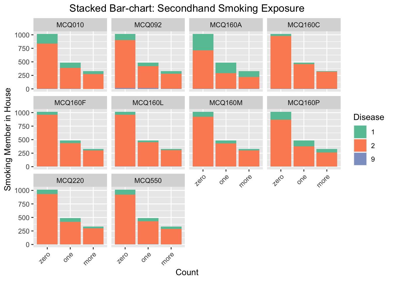
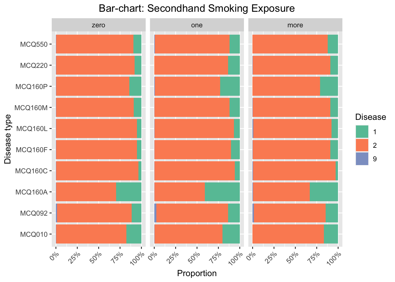
3.3.2 Secondhand smoking exposure
Code
#bar chartggplot(data_second, aes(fill=Disease, x=Smoking_exposure)) +geom_bar(position='stack') +facet_wrap(~Disease_type) +scale_fill_brewer(type ="qual", palette ="Set2") +theme(plot.title=element_text(hjust =0.5),axis.text.x =element_text(angle =45, hjust =1))+labs(x ='Count', y ='Smoking Member in House', title ='Stacked Bar-chart: Secondhand Smoking Exposure')
We focus on the influence of secondhand smoking exposure to the probability of having certain disease. The secondhand smoking exposure is measure by the reported number of respondents smoking at home. We find that the influence of secondhand smoking exposure is noticeable for MCQ010-asthma, MCQ160A-arthritis, MCQ160P-COPD, emphysema, ChB, and MCQ220-cancer or malignancy. For these three categories, the number of respondents have had the disease and one or more family members smoke at home is much higher than the number of respondents have had the disease and zero family member smoke at home.
Code
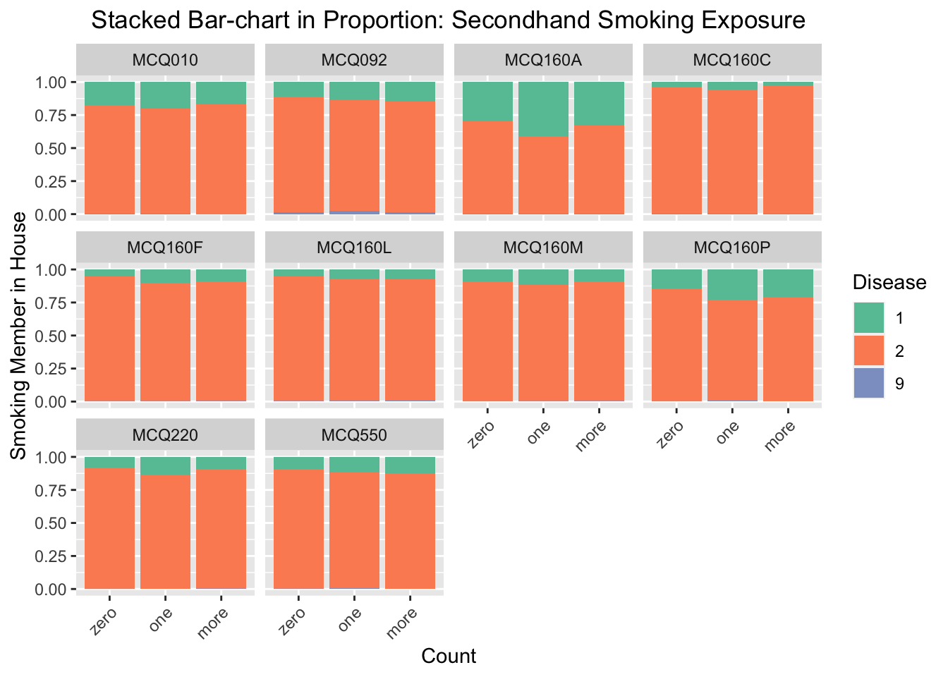
#bar chartggplot(data_second, aes(fill=Disease, x=Smoking_exposure)) +geom_bar(position='fill') +facet_wrap(~Disease_type) +scale_fill_brewer(type ="qual", palette ="Set2") +theme(plot.title=element_text(hjust =0.5),axis.text.x =element_text(angle =45, hjust =1))+labs(x ='Count', y ='Smoking Member in House', title ='Stacked Bar-chart in Proportion: Secondhand Smoking Exposure')
We regenerate the bar chart and set the y-axis scale as proportion as before. According to the stacked bar-chart, the proportion of getting MCQ160A-arthritis and MCQ160P-COPD, emphysema, ChB, are much higher for the group of respondents that one or more family members smoke at home. For other diseases, there are also small increasings in proportions when comparing the group of respondents that one or more family members smoke at home with the group of respondents that have zero family members smoke at home. We thus conclude that secondhand exposure will increase the probability of getting disease in general, and is especially influential to arthritis and COPD, emphysema, ChB.
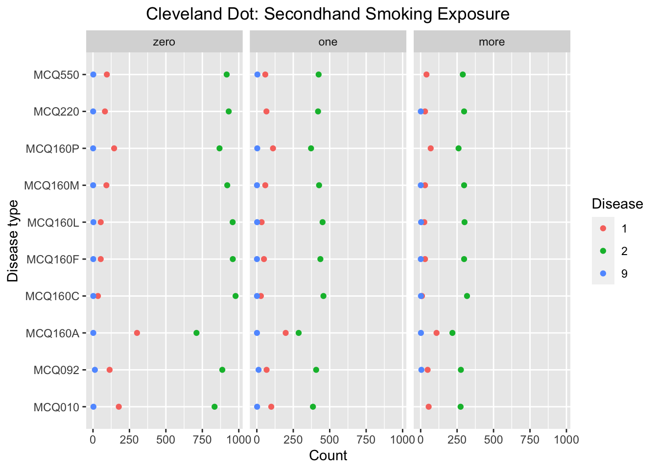
3.4 Cleveland-dot plot
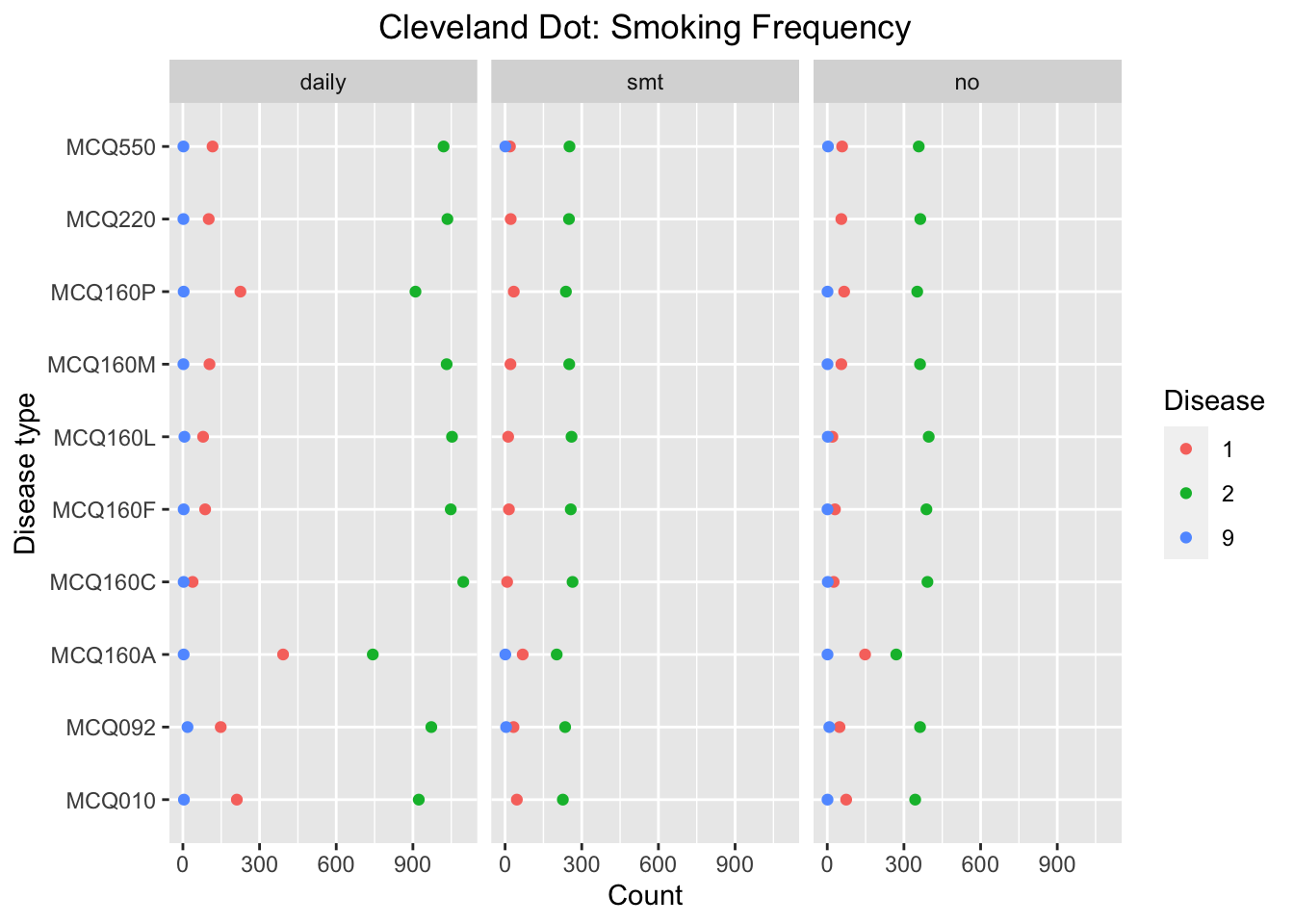
We use two Cleveland Dot plots to visualize the influence of smoking exposure to probability of getting difference diseases by summarizing the count of respondents having and not having disease for each disease and smoking exposure groups. The Cleveland Dot plot allows us to visualize the differences in number of answers among different diseases categories.
3.4.1 Smoking frequency
We can see that the number of answer ‘yes’ in MCQ160A-arthritis and MCQ160P-COPD, emphysema, ChB, is significantly higher compared to other diseases for the group of respondents smoking daily. For MCQ160A, the proportion of ‘yes’ is high for all three smoking exposure groups, whereas for MCQ160P, the proportion of ‘yes’ is high only for the group of respondents smoking daily. Thus we make conclusion that probability of getting MCQ160P-COPD, emphysema, ChB will be influenced by smoking frequency. This conclusion is consistent with the conclusion from Bar-chart.
3.4.2 Secondhand smoking exposure
Code
data_second %>%count(Disease_type, Disease, Smoking_exposure) %>%ggplot(aes(x = n, y = Disease_type)) +geom_point(aes(colour = Disease)) +facet_wrap(~Smoking_exposure) +scale_fill_brewer(type ="qual", palette ="Set2") +theme(plot.title=element_text(hjust =0.5)) +labs(x ='Count', y ='Disease type', title ='Cleveland Dot: Secondhand Smoking Exposure')
We can see that the number of answer ‘yes’ in MCQ160P-COPD, emphysema, ChB, is significantly higher compared to other diseases for the group of respondents that there is one or more family member smoking at home. Besides, the proportion of ‘yes’ is higher compared to the group of respondents that there is zero family member smoking at home for MCQ160P. Thus we make conclusion that probability of getting MCQ160P-COPD, emphysema, ChB will be influenced by secondhand exposure. This conclusion is consistent with the conclusion from Bar-chart, but it is not clear that whether there is a general influence of secondhand exposure to probability of getting disease by analyzing this Clevelard dot plot.
3.5 Bar-chart facet by smoking exposure
Similar to Cleveland Dotplot, we want to compare the influence between different diseases using horizontal bar-charts where x-axis represents the proportion of the response to every disease.
We can see that the proportion of answer ‘yes’ in MCQ010-asthm, MCQ160A-arthritis and MCQ160P-COPD, emphysema, ChB, is significantly higher compared to other diseases for the group of people smoking daily. For MCQ010 and MCQ160A, the proportion of ‘yes’ is high for all three smoking exposure groups, whereas for MCQ160P, the proportion of ‘yes’ is high only for the group of respondents smoking daily. Thus we make conclusion that probability of getting MCQ160P-COPD, emphysema, ChB will be influenced by smoking frequency. This conclusion is consistent with the conclusion from Clevelard dot plot.
We can see that the proportion of answer ‘yes’ in MCQ010-asthm, MCQ160A-arthritis, and MCQ160P-COPD, emphysema, ChB, is significantly higher compared to other diseases for the group of respondents that there is one family member smoke at home. For MCQ160A and MCQ160P, the proportion of ‘yes’ is higher compared to the group of respondents that there is zero family member smoke at home. Thus we make conclusion that probability of getting MCQ160A-arthritis and MCQ160P-COPD, emphysema, ChB will be influenced by smoking frequency. This conclusion is consistent with the conclusion from the bar-charts facet by disease types.